I am new to R. While working on my university assignments, I found that legends for Base R plot do not show correct information, hence I switched to ggplot2 wherever legends were needed.
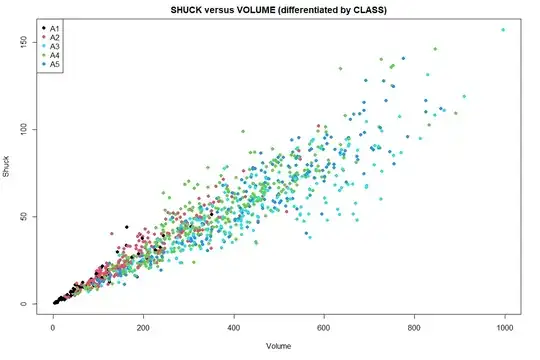
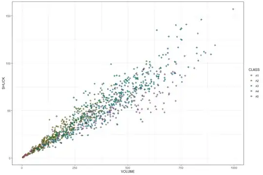
I observed although Base R color code the data (example differentiated by CLASS as was required in our assignment) but legend failed to show right CLASS with respect to color scheme i.e. In graph if Cyan is actually representative CLASS A5 (given the position of points), legend will show something else say Cyan as CLASS A3. There's no way to know it's wrong, until you try same with ggplot2 and find the differences.
Same error never occurs with ggplot2. I have attached both results and code for comparative analysis.
I used below code for Base R:
#A scatter-plot of SHUCK versus VOLUME differentiated by CLASS
plot(y=mydata$SHUCK,x=mydata$VOLUME,main = "SHUCK versus VOLUME (differentiated by CLASS)",col=mydata$CLASS, xlab = 'Volume',ylab = 'Shuck', pch=16)
# Add a legend
legend("topleft", legend=levels(mydata$CLASS), pch=16, col=unique(mydata$CLASS))
If I run similar code using ggplot2, I get legend showing different result. I used below code for ggplot.
x <- ggplot(mydata, aes(VOLUME, SHUCK)) + theme_bw()
x + geom_point(aes(fill = CLASS), shape = 23, alpha = 0.75)
To clarify further, if we check images for Base-R and ggplot with legends, it seems Class A5 in pink for ggplot is represented by Class A3 in cyan for Base R which is wrong
I know I am doing something wrong when I use Base R. How should I add legend in Base R such that legend is in sync with order of color-coded representation in graph to maintain accuracy of representation of actual class of data-points in case of categorical data?
Has anyone experienced same? Any guidance will be helpful. Thanks

