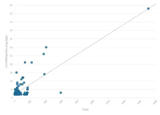
I can't say if your scatterplot is correct or not, because I don't know your dataset. I suppose that the point with total = 1.800 and numWikipediaLanguages = 53 is an outlier. So, you can try to delete it and replot the graph.
Another test that you could try is to add a feature called "subject" and divide your data (i.e.: subject -> "history", "math", "science" and so on).
Follow youe example:
Work, links, wikipediaTranslatedPages, Subject
The name of the rose, 500, 53, Literature
In this way you can see if there is a particular class of items (subject) that stands out from the others. But I don't know your data or your problem and if you have the possibility to add a feature.
