7

I am working on a dataset. The dataset consists of 16 different features each feature having values belonging to the set (0, 1, 2). In order to check the distribution of values in each column, I used pandas.DataFrame.hist() method which gave me a plot as shown below: Figure

I want to represent the distribution for each value in a column with different color. For example, in column 1, all the values corresponding to '0' should be in red color while the values corresponding to '1' in green color and so on. How can I do this? Please help!

Brian Spiering
  • 20,142
  • 2
  • 25
  • 102
enterML
  • 3,011
  • 9
  • 26
  • 38
  • Have you tried to use colormap argument? – Hima Varsha Nov 11 '16 at 09:34
  • Nah, I don't know how to use that in the pandas.DataFrame.hist() method – enterML Nov 11 '16 at 12:12
  • Shouldn't this question really be on SO?! The data science aspect is really secondary here... it's more of a pure pandas/matplotlib question isn't it? – Julien Marrec Nov 17 '16 at 08:19
  • In any case, similar to Stack Overflow, a [mcve](http://stackoverflow.com/help/mcve) would be very welcomed here, so one doesn't have to scratch his head to recreate dummy data to play with. – Julien Marrec Nov 17 '16 at 08:20

2 Answers2

8

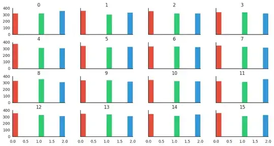
There isn't any built-in function to do this directly in pandas, but by getting the array collection of AxesSubplot, iterating on them to retrieve the matplotlib patches you can achieve the desired result.

Here's some dummy data to play with:

import pandas as pd
import numpy as np
df = pd.DataFrame(np.random.randint(low=0, high=3, size=(1000,16)))

Now, here's the magic:

import matplotlib.pyplot as plt

# Plot and retrieve the axes
axes = df.hist(figsize=(12,6), sharex=True, sharey=True)

# Define a different color for the first three bars
colors = ["#e74c3c", "#2ecc71", "#3498db"]

for i, ax in enumerate(axes.reshape(-1)):
    # Define a counter to ensure that if we have more than three bars with a value,
    # we don't try to access out-of-range element in colors
    k = 0

    # Optional: remove grid, and top and right spines
    ax.grid(False)
    ax.spines['top'].set_visible(False)
    ax.spines['right'].set_visible(False)

    for rect in ax.patches:
        # If there's a value in the rect and we have defined a color
        if rect.get_height() > 0 and k < len(colors):
            # Set the color
            rect.set_color(colors[k])
            # Increment the counter
            k += 1

plt.show()

Resulting hist subplot with colors

Julien Marrec
  • 260
  • 2
  • 5
0

In my case, I wanted to change the color of the bins based on the x-axis. Going along with Julien Marrec's answer, that can be achieved with rect.get_x().

ax = df.Confidence.plot.hist(bins=25, rwidth=0.7)

for rect in ax.patches:
    if rect.get_x() >= 0.5:
        rect.set_color('#55a868')

enter image description here