1

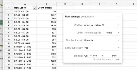
Take the following historgram data:

enter image description here

This is an item of "bin size" 1 from 0 onwards. However, I do not think this looks appropriate, as every time I have seen a histogram (or someone has requested it), it has unambiguous values, such as:

$ 0.00 - $0.99
$ 1.00 - $1.99
etc.

However, not even Excel does this correctly, so I was wondering if there was something like a suggested "significant figures" to apply to a histogram so that:

(1) It looks human, common-sensical, and proper; and (2) There are not overlapping intervals [0, 1), [1, 2), etc.

Perhaps this is correct in a mathematical sense, but I'm looking for a more non-analytical intuitive representation of the pricing data. What is the suggested practice here?

P.S. Is this the correct site for this question? Or should it be on Cross Validated or StackOverflow?
Brian Spiering
  • 20,142
  • 2
  • 25
  • 102
David542
  • 111
  • 1
  • For what it's worth, I think DataScienceSE is the most appropriate site for this question, since it's not related to programming or statistics. However I'm not sure what the question is about: is it about having labels displayed as proper intervals? (R can give labels like [1,2), [2,3)... for example). But imho a standard histogram is not made like this anyway, it's made from the actual original values instead of specifying the bins in advance (but maybe there's a reason why you do it this way). – Erwan May 28 '20 at 18:25
  • @Erwan well yes and no. Yes it's usually done that way, but often in marketing and finance/pricing there are very specific 'bins', such as various target demographics (ages) or specific price buckets ($1.99-$4.99). Or at least, in any sort of analysis I've seen tied to those two, the labels/buckets are pretty similar. Does that make sense/seem accurate? – David542 May 28 '20 at 18:33

0 Answers0